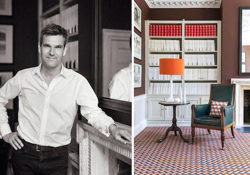
Ben Pentreath is an interior and architectural designer, shopkeeper, author and journalist. From his two design studios in the heart of London’s Bloomsbury, Ben works on a huge variety of buildings. He is renowned for his fresh approach to classical and traditional design and injects a strong use of colour and pattern into his interiors.
Pentreath & Hall, which Ben co-founded with Artist and Maker Bridie Hall, is one of the liveliest and most written about small shops in London.
Ben has written three books of which the best known is ‘English Decoration’, published to acclaim by Ryland Peters & Small in 2012. His new book, ‘English Houses’, will follow in 2016.
Alternative Flooring is delighted to announce Ben Pentreath as its new carpet collaborator.
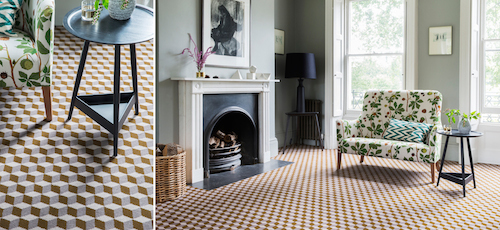
Quirky B, Cube in Webb, Ben Pentreath for Alternative Flooring
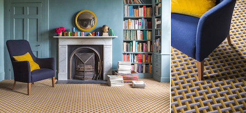
Quirky B, Lattice in Flitcroft, Ben Pentreath for Alternative Flooring
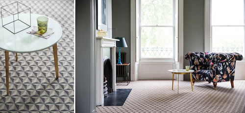
Quirky B, Tetra in Archer, Ben Pentreath for Alternative Flooring
“Pattern is back” declare a million and one design magazines this summer – and, certainly, visiting the September Maison&Objet fair in Paris this week, geometrical and three-dimensional pattern-making is, as they say, ‘bang on trend’. The lovely people at Alternative Flooring and I can, I suppose, breathe a sigh of relief when our new range of carpet patterns are launched at Decorex this month. I think we’ve got it just about right for the moment…
But isn’t it a funny process how we design things? None of that was intentional. Over at Pentreath & Hall, the interiors shop that I run with my collaborator, decorative artist and maker Bridie Hall, we began to think about designs for a new range of wrapping paper a few years back now. And for inspiration, Bridie and I had both (separately) turned to one of the books that I use a lot in our architectural practice – Batty Langley’s Treasury of Designs, published in 1740.
We’d both been drawn to a similar series of engraved patterns for stone floors that Langley had designed, using three or four different colours of marble or stone to create a rich effect of three-dimensional tromp-l’oeil. If, like me, your idea of holiday fun is trekking around Venetian or Roman buildings, you’ll find these geometrical floors all over 16th and 17th century classical and Baroque churches and Palazzi. They made an easy import into the heady, vibrant world of early Georgian England – where colour, pattern and texture abounded in eyewatering shades and intensity – today’s world is very dull by comparison. Batty Langley – the eccentrically named architect who was ultimately more famous for his influential books than for his buildings – did more than anyone else to propulgate and popularise this energetic classical language. His books spread like wildfire through the ranks of humble craftsmen, joiners, stonemakers and carpenters – and no town in England is without details and doorcases pulled directly from Batty’s manual.
Bridie and I selected four of Batty’s patterns and went through a long process of manipulating and colouring the designs. Then started production – finding great English printers, selecting weights of paper, running colour tests, and finally agreeing to print enough sheets of wrapping paper to fill up both of our houses for several years to come. The whole process took months – in fact, well over a year from our first chat to finally having twelve paper patterns on the rack.
A year ago, I was asked by Alternative to collaborate on a range of carpets for their already well-established ‘QuirkyB’ line. It didn’t take long to realise what I wanted to do. Batty’s patterns had come off the floor, and I wanted to put them straight back. The process was not unlike the patterned papers – although with the reassuring presence of Alternative Flooring to hold my hand along the way. First, we needed to consider the scale of the pattern – large enough to have impact, and for the three-dimensional trompe-l’oeil to work… small enough not to completely do your head in.
That established, we embarked on the colouring process, which itself was quite complex – needing to respond to the very specific wools that Alternative have set up on their looms at the factory in Wilton (not far from where I live, down in South-West England, which always makes me happy when I drive past). We took forward three of the Langley patterns and coloured each in four different colourways. I wanted each carpet to relate to one another – meaning, perhaps, that you could move from pattern to pattern in a project, but with a common unifying theme – and several of these had to be worked on a few times until I was happy that the balance of colours was just right. Some patterns we wanted to be very rich (and I rejoiced in the fact that Alternative had some toffee and brown colours that are really 70s in feel…); other colours wanted to be much more neutral.
Finally, the terrifying moment when you see the first large-scale piece of carpet in a room set – ready for my portrait to be taken. I stared, and blinked. The pattern was intense, in a way that set my heart racing. It looked absolutely beautiful, and we’re getting our office boardroom carpeted with some of that first carpet to run off the mills right now.
And in terms of the zeitgeist – I thought… yes, this is good. But I take even more comfort in knowing that there’s something a little bit Georgian, and a little bit 1970s in my carpet patterns. Because most importantly of all, I think this means that they might just stand the test of time – and that’s the only test I’m really interested in.
http://www.alternativeflooring.com/collection/quirky_b
Ben Pentreath for Alternative Flooring launches on Alternative Flooring Stand C21 at Decorex, 20 – 23 September, 2015. www.decorex.com/exhibitors/alternative-flooring


